Scroll
The argument
There are several revenue paths in the business — agent subscriptions, landlord services — but the application carries the most transactions and the most money. So the redesign treats it as a conversion problem, not a form problem.
Fewer people dropping out. Information that's actually correct. A payment relationship that carries forward once someone's accepted.
What was leaking
Applicants couldn't tell how much was left or where they were. A rental application isn't a session — it's an errand people do across several sittings, with documents they have to go find.
People found out their information was wrong only after the background and credit checks came back with problems. By then the report had been pulled.
People believed they were done at submit, when report review and sharing still remained. "Submitted" was doing double duty across the flow and the confirmation email.
Arc one
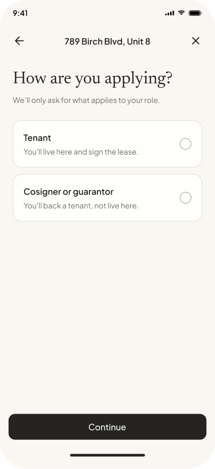
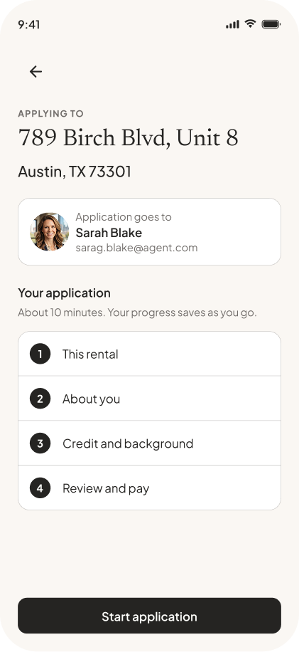
Fewer steps was the baseline move. The overview page is the real one: completion state at the end of each step, edit in place as you go, save and return whenever. It's designed for resumption, not completion in one pass — that's what the errand insight buys you, and it's why the overview is the spine of the flow rather than a nav convenience.
Moment one
Moment two
Arc two
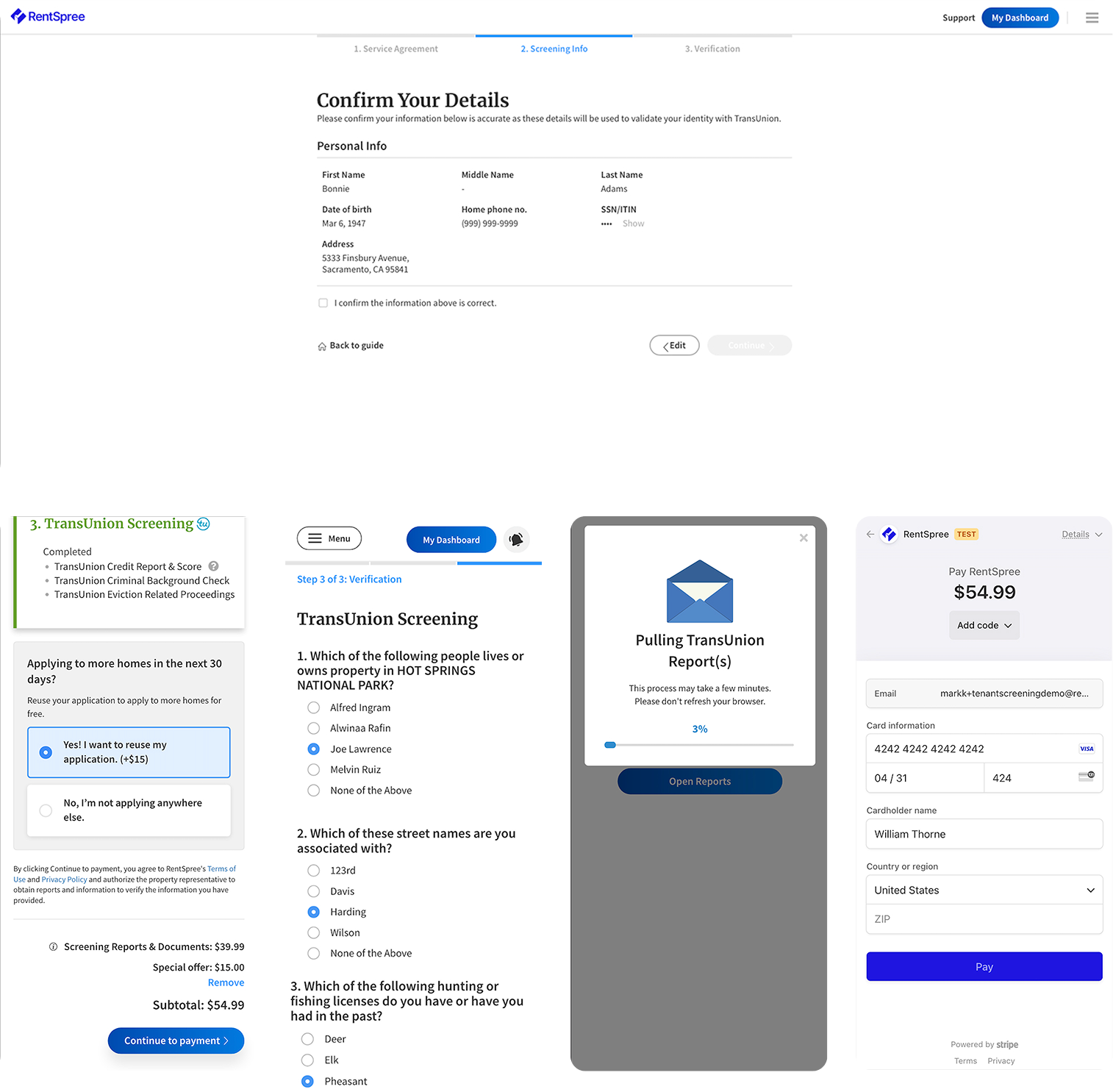
This came from support. Applicants were telling us, after they submitted, that their credit or background check came back with errors — and the reason was that their own information was wrong. A misspelled name, an old address, a transposed digit. They hadn't caught it, and there was no point in the flow where we'd asked them to.
By the time the error surfaces, the report has already been pulled. The fix wasn't better validation. It was giving people a real chance to look at what they'd entered before anything irreversible happened.
And again on the way out: applicants review their reports before anything goes to the agent.
Two different guarantees. Check your inputs. See your outputs.
Running underneath all three: a full pass on section titles, page titles, descriptions, and form patterns. Titles say what. Descriptions say why, capped around twelve words. No internal jargon in applicant-facing copy — "Screening reports" became "Credit and background."
Arc three
Payment moved after review, for two reasons: applicants know what they're paying for, and errors get caught before the bureau call. The reuse upsell sits at that same moment — apply to as many properties as you like for 30 days, add-ons priced separately. The placement is the argument. The upsell only makes sense once someone has seen how much work they just did.
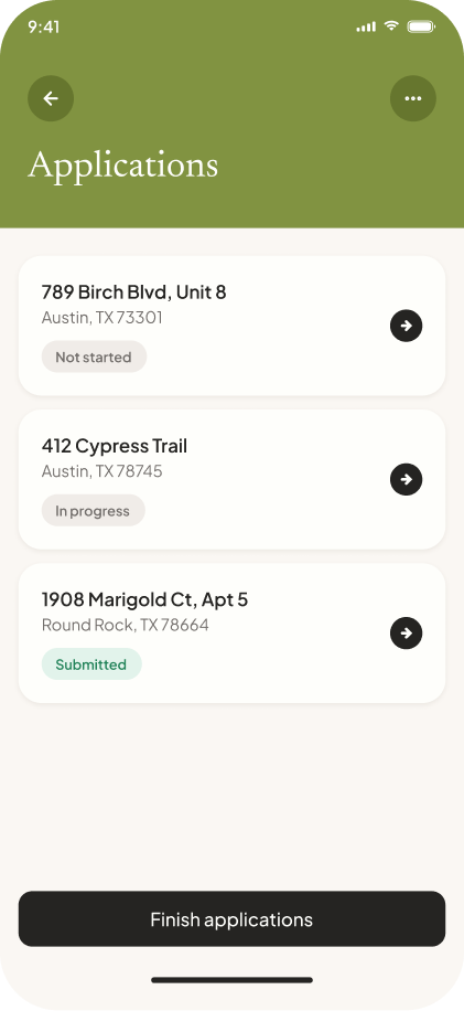
Three applications open at once is the normal case, not the edge case — that's the screen from the top of this page, and it's the reason a 30-day package means anything.
On saving the card: the next steps after this flow are accepting an applicant, then a deposit, then recurring rent. This is where the payment relationship starts. Designed as a one-time transaction, that door closes.
How it got built
The abandonment instrumentation was competing with feature work and wasn't winning on UX arguments. So I reframed it as a margin question for my engineering partners: an application abandoned before the report is pulled costs nothing in bureau fees, which makes recovered abandonment close to pure contribution margin. It made the build slice.
I also built the design-to-code prototype pipeline and scaled it to the team, which is why you're clicking through working code on this page instead of static frames.
Still open
All three serve the same thing — a landlord who trusts what they're looking at, and an applicant who doesn't have to start over.